
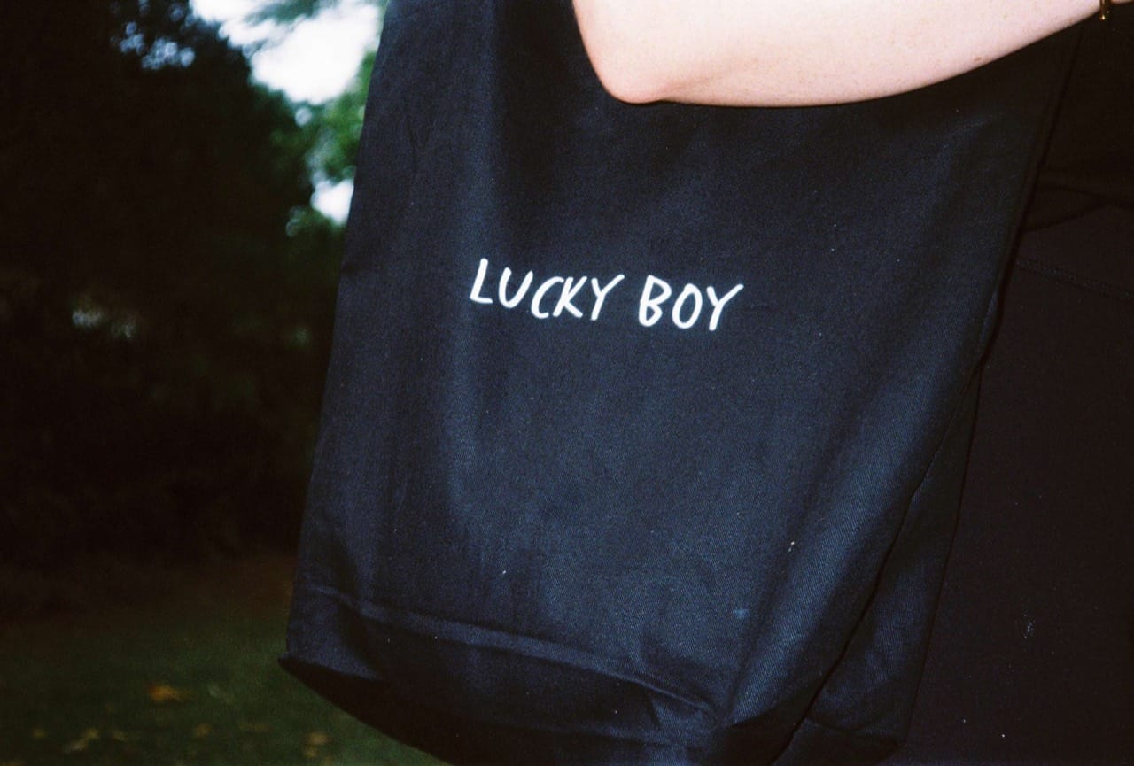
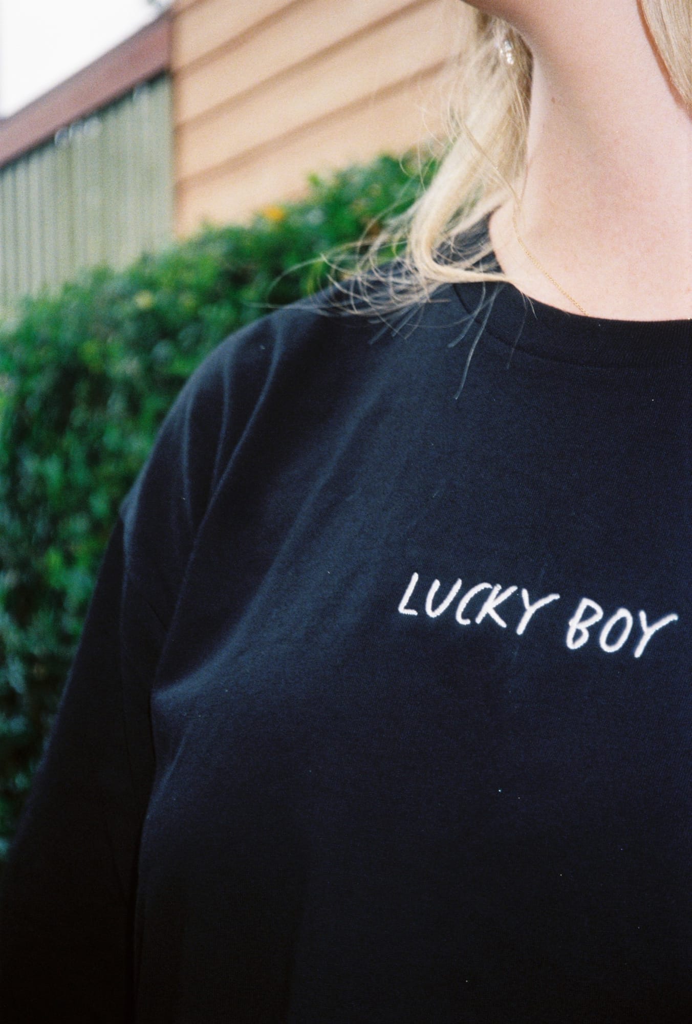
Brand guidelines
The system that keeps Lucky Boy looking like Lucky Boy.
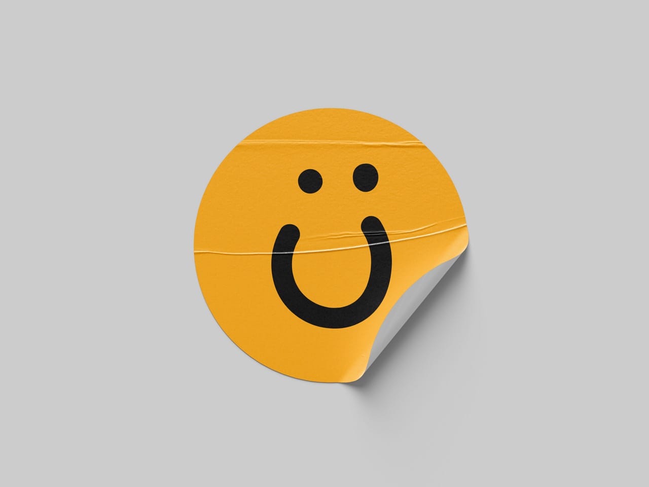
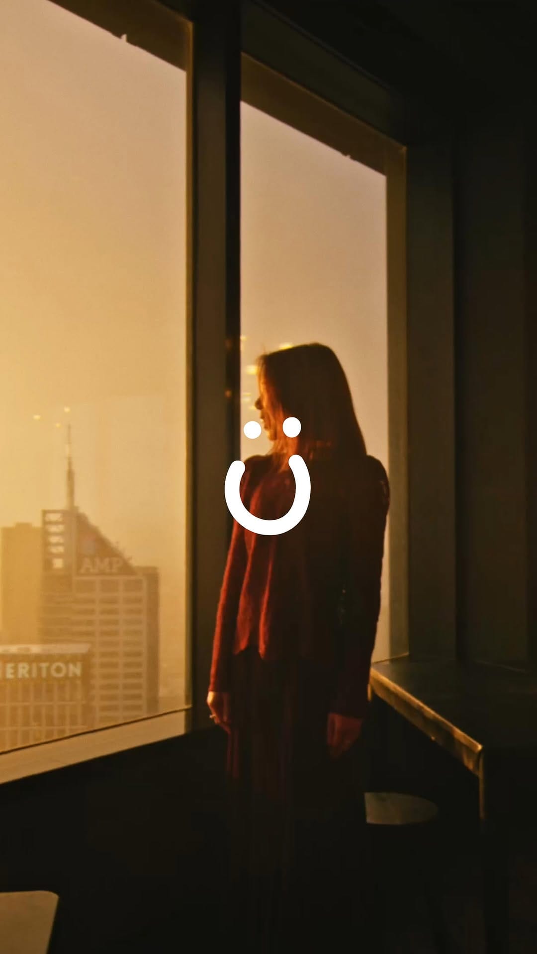
Marks
The Lucky Boy identity in five cuts: the smile as primary, the full-colour face, and the wordmark.
Use dark marks on light surfaces, light marks on dark. Never recolour, stretch, or redraw. Click a tile to pull the SVG.


Type
Zalando Sans at 400 carries every line.
500 lifts small-head labels; 600 holds the eyebrow cap. Caps stay scoped to eyebrows and buttons. Everything else runs in mixed case.
- H1Brand guidelines.Display · 400 · -0.04em · 40 to 64px · Sentence case
- H2MarksSection · 400 · -0.03em · 32 to 48px
- H3Primary lockupSubsection · 400 · -0.02em · 24 to 32px
- H4Smile monogramBlock · 400 · -0.015em · 19 to 24px
- H5Use dark marks on light surfaces.Small head · 500 · -0.01em · 18px
- H6Say helloEyebrow · 600 · 0.05em · 13px · Uppercase
- BodyWe're Lucky Boy, a Melbourne creative and marketing agency. Tell us what you're working on and we'll be in touch soon.Paragraph · 400 · 0em · 17px
- Small© 2026 Lucky Boy Agency · ABN 94 658 730 717Fine print · 400 · 0em · 13px
Colour
Cream as the constant, ink as the counter-weight, orange as the single moment of warmth. Every surface lands on one of the five core steps. Ink does double duty, carrying both text and the footer surface, so chrome reads as a natural extension of the type, not a separate palette.
The orange to yellow gradient is reserved for accents, never for body copy. Ink on cream sits at 17.4:1, well clear of AA body. Orange on cream is 1.64:1, decorative use only.
Yellow is the sparingest step. Target 5% or less of any composition, reserved for the accent gradient's end stop and single-moment highlights. Never a primary fill, surface, or text colour. When in doubt, use orange instead.
- CreamPage background#EAE9E8RGB 234 233 232
- InkText, primary fill, footer surface#050505RGB 5 5 5
- OrangeAccent, single moment#F9A719RGB 249 167 25
- YellowGradient end stop, 5% max#FCD619RGB 252 214 25
- MutedSecondary text on dark#777777RGB 119 119 119
- Accent gradientOrange to Yellow#F9A719 to #FCD61990deg, linear
Spacing
A 4px grid. Every gap, padding, and rhythm value in the system derives from the scale below so nothing lands on an arbitrary number.
Use the smaller steps inside components (1 to 8), the middle steps between components (8 to 24), and the big steps for section breathing room (32 to 128).
- 4--space-1 · 0.25rem · Hairline, icon pad
- 8--space-2 · 0.5rem · Tight stacks
- 12--space-3 · 0.75rem · Inline group gap
- 16--space-4 · 1rem · Default paragraph
- 20--space-5 · 1.25rem · Small block gap
- 24--space-6 · 1.5rem · Block gap, mobile gutter
- 32--space-8 · 2rem · Sub-section gap
- 40--space-10 · 2.5rem · Component spacing
- 48--space-12 · 3rem · Component spacing
- 64--space-16 · 4rem · Half section gap
- 80--space-20 · 5rem · Section padding, mobile
- 96--space-24 · 6rem · Section padding
- 128--space-32 · 8rem · Section padding, desktop
Motion
Motion should feel quick, directed, and off the screen before you notice it. Three eases cover almost every case: default for UI, in for exits, out for entrances.
Three durations: fast for micro-interactions, base for standard transitions, slow for full-screen moments. Nothing runs longer than 400ms except the menu curtain.
- Default--ease-default · cubic-bezier(0.4, 0, 0.2, 1) · Standard UI motion
- In--ease-in · cubic-bezier(0.4, 0, 1, 1) · Element leaves the screen
- Out--ease-out · cubic-bezier(0, 0, 0.2, 1) · Element enters the screen
- 150ms--duration-fast · Fast · Hover, focus, micro-tweens
- 250ms--duration-base · Base · Standard UI transitions
- 400ms--duration-slow · Slow · Menu open, page transition
Components
Buttons are pill-shaped, 999px radius, ink primary for high intent, outline secondary for supporting actions. Both variants share one hover grammar: opacity fade, never a colour swap.
Inputs take the hairline underline pattern from the footer, H5 spec inside, ink focus thickens the underline to 2px. Every component runs on the shared token set, no bespoke sizes.
- PrimaryPill 999 · Ink fill · Cream text · Opacity hover 0.85, active 0.75 · H6 cap label
- SecondaryPill 999 · Transparent fill · Hairline ink border · Opacity hover 0.65, active 0.5
- InputHairline underline · H5 spec · Ink · Focus thickens underline to 2px