
Branding Nocturne: how we built a fantasy ball from three routes to one
Event Society came to us with a night that did not exist yet. Here is how we took Nocturne from three competing design routes to a finished brand, a guideline, a launch film and a website, twelve months before the doors open.
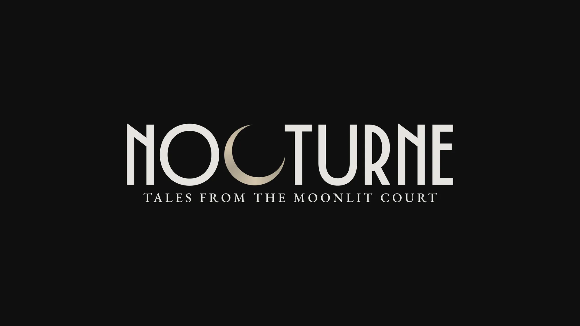
Nocturne is a fantasy ball. One night, 24 July 2027, at Dust Temple in Currumbin on the Gold Coast. A twilight artisan market, a candlelit banquet for a hundred guests, then a masquerade with performers, dancing and a full court of characters. Tickets run $290 and $390.
It is the newest brand from Event Society, and when they came to us it did not exist yet. No venue photos, no crowd shots, no footage of last year, because there was no last year. We had a name, a feeling, and a date twelve months out.
That is the interesting part of this job, and the reason it is worth writing up. We were asked to do the branding and the website, and both had to sell an experience nobody had been to. Here is how it went.
The brief: sell a night that does not exist yet
Most event marketing leans on last year. Photos of a packed room, a highlights reel, a queue down the street. A first edition has none of that. Every bit of persuasion has to come out of the design.
So the brand had one job before anything else: make someone believe the room is worth $390 and a costume, on atmosphere alone. That pushes the work in a specific direction. It has to feel expensive, it has to feel like a world rather than a poster, and it has to hold together across a website, a social feed, an invitation and a film, because those are the only things a first-year guest will ever see.
The second thing shaped the system more than the first. Nocturne is not meant to be a one-off. Event Society want to run it again, with a different theme each time. So whatever we built had to be able to change its clothes without becoming a different brand.
Three routes, three different worlds
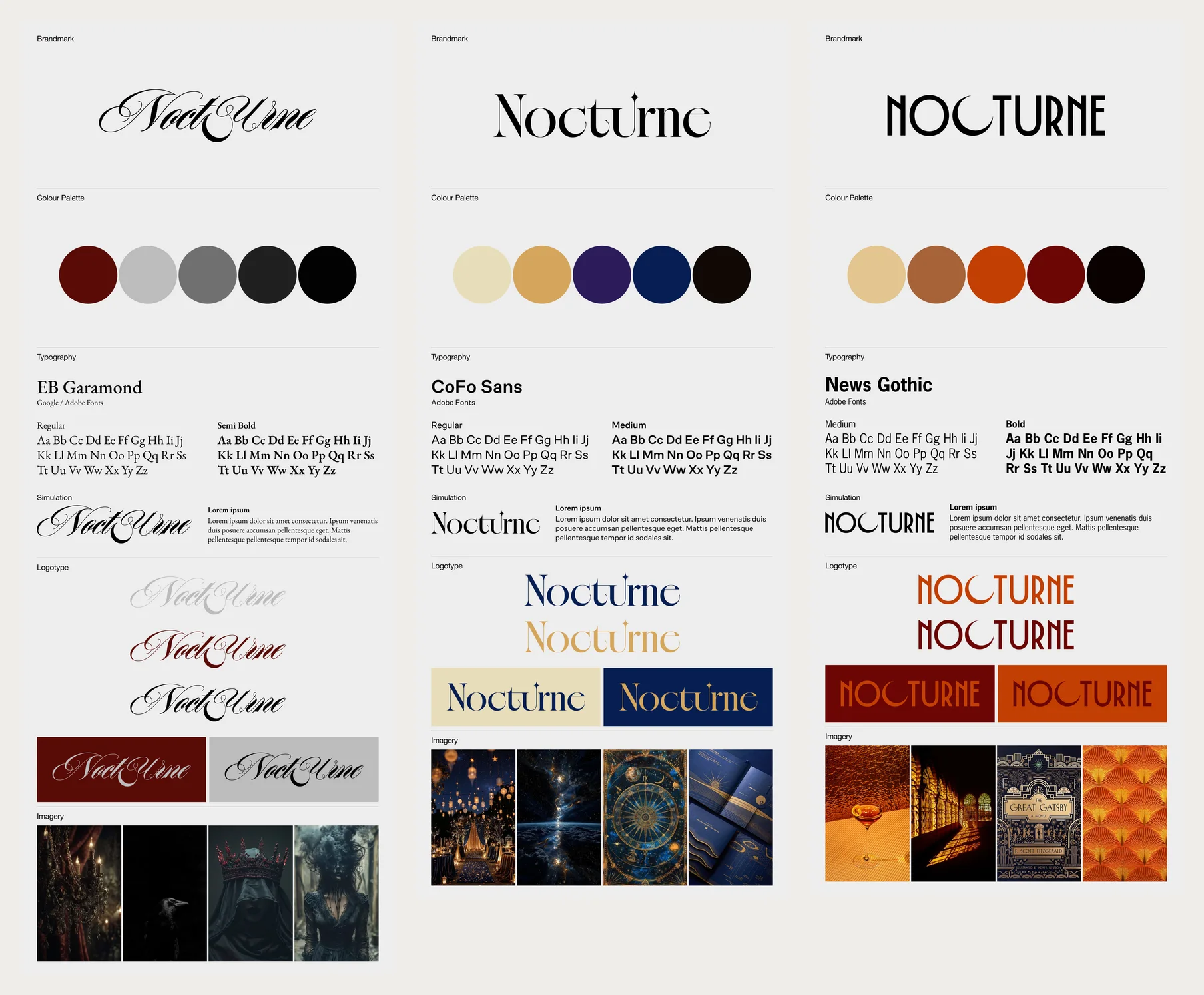
We put a spread of directions in front of them rather than one recommendation. Not variations on a theme, genuinely different worlds, because at this stage the useful question is not which shade of red but which story we are telling.
The first was gothic. A calligraphic script logotype, oxblood against greys, imagery of ravens, crowns, chandeliers and veiled figures. Romantic and a bit dangerous. The risk was that it reads as Halloween, and a Halloween brand is hard to charge $390 for.
The second was celestial. A high-contrast display serif with a star finial cut into the letterform, set with CoFo Sans, in cream, gold, violet and navy. Lantern-lit gardens, star charts, nebulae. Beautiful, and the softest of the three. The risk was that it drifts toward wedding stationery.
The third was Art Deco. Geometric capitals, News Gothic underneath, a palette of tan, rust, terracotta and oxblood, with Gatsby-era fan patterns and amber light. Confident and graphic, and the only one of the three that looked like a poster you would keep.
What we landed on, and why
Event Society went with the deco geometry, and then the real work started, because the route board is a mood, not a brand.
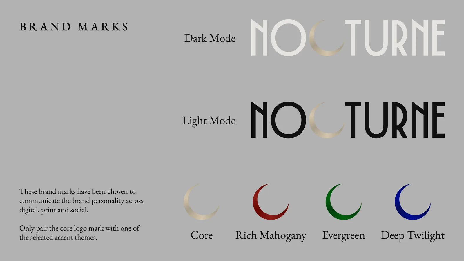
The wordmark is drawn from scratch. Deco capitals, high waist, thin joins, the sort of letterforms that look cut rather than typed. The move that makes it is the C: we removed it and put a crescent moon in its place. The eye completes the letter, so it reads as NOCTURNE, and it also reads as a moon. One mark doing two jobs.
The rest of the route did not survive. The rust and terracotta went, replaced by an almost-black ground called Onyx (#0F0F10), a warm off-white called Bone (#E7E4E0), and a metallic Pale Oak (#D3C5AC) for the moon itself. News Gothic went too. Everything is now set in EB Garamond, which sounds like a step backward from a custom deco face until you see it: the deco wordmark does the announcing, and the Garamond underneath makes it feel like a book rather than a flyer.
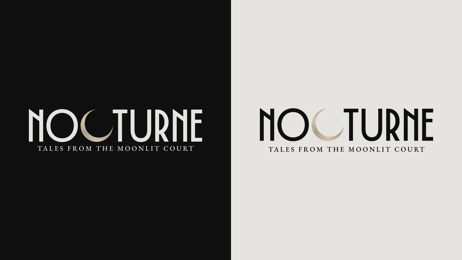
The lockup runs in two modes. Pale Oak on dark, and the accent colour on light. That distinction is written into the guideline so nobody has to guess.
The crescent had to work on its own
A wordmark that clever is a liability if it only works at one size. A ball needs a mark that survives a favicon, a wax seal, an Instagram avatar and a lapel pin, and the full lockup with its tagline does none of those.
So the crescent was drawn to stand alone. Pulled out of the wordmark it becomes the brand mark, and it is the thing you see in the browser tab and the corner of a social tile. There is also a wordmark without the moon, for the rare cases where the mark is already on screen and repeating it would be noise.
That gave us a small kit rather than one logo: full lockup, wordmark, standalone crescent, each in both modes and each in every accent colour.
One core palette, an accent that changes every year
This is the part of the system we are most pleased with, and it comes straight out of the brief.
Nocturne is a recurring event with a different theme each edition. The obvious ways to handle that are both bad. Keep one fixed palette forever and every year looks the same. Redesign the palette each year and there is no brand, just a series of posters.
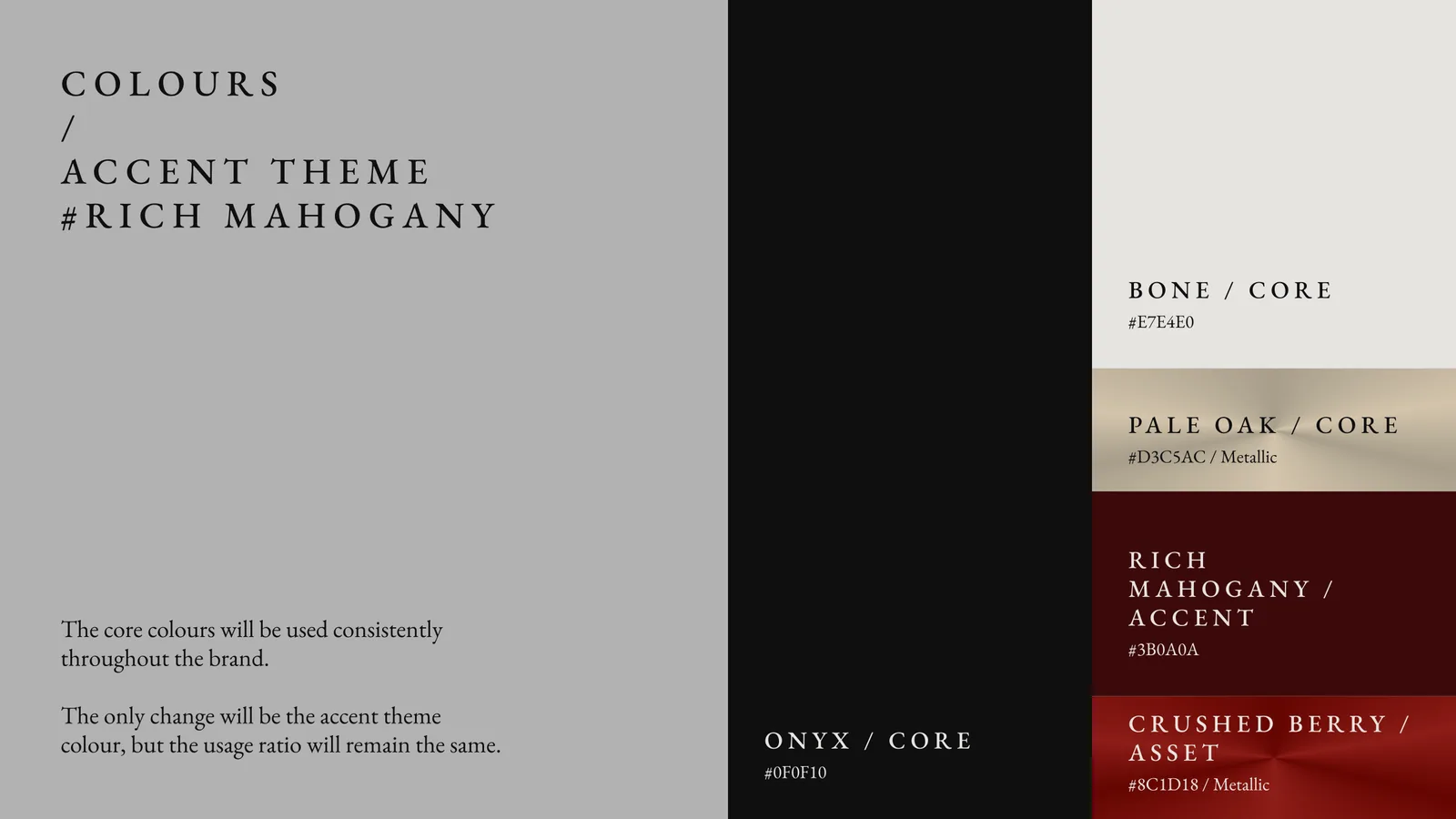
So the guideline splits the palette in two. The core is locked: Onyx, Bone and Pale Oak, used in the same proportions every single time. Then a single accent theme sits on top and that is the only thing that moves. The first edition runs Rich Mahogany (#3B0A0A) with Crushed Berry (#8C1D18) as its metallic. Waiting behind it are Evergreen (#002807) with Dark Emerald, and Deep Twilight (#000649) with Dark Ultramarine.
The rule in the guideline is one line long and it is the whole idea: the core colours stay consistent, only the accent theme changes, and the usage ratio stays the same. Which means the 2028 edition can be green and still unmistakably be Nocturne, with no rebrand and no new guideline. Just a different accent switched in.
The crescent is where you see it most clearly. Same mark, same geometry, same gradient treatment, four different colours, and each one still obviously the same brand.
Taking it off the artboard
A guideline is only worth the applications that come out of it, so we built the pieces the launch actually needed.
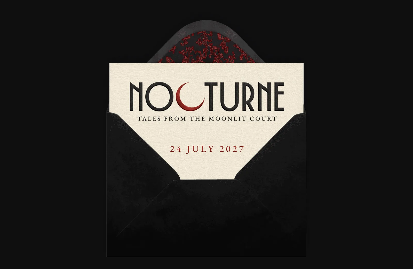
The invitation suite came first. A blind-embossed card on a bone stock, the crescent picked out in the accent red, the date underneath in Garamond small caps, sitting in a black envelope with a red damask liner. It is digital-only for now, drawn at print specs so it can go to press whenever Event Society want it to.
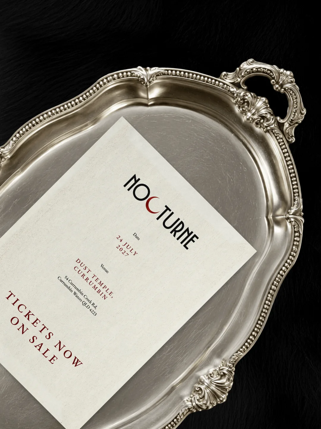
Then the social assets. The trick with these was to avoid the thing every event brand does, which is put the logo on a photo. Instead we shot the brand as an object: an invitation lying on an antique silver tray, the type running at an angle, the whole thing lit like a still life. It is the same silver-and-candlelight world the ball itself is going for, and it gives the feed something to look at that is not a poster.
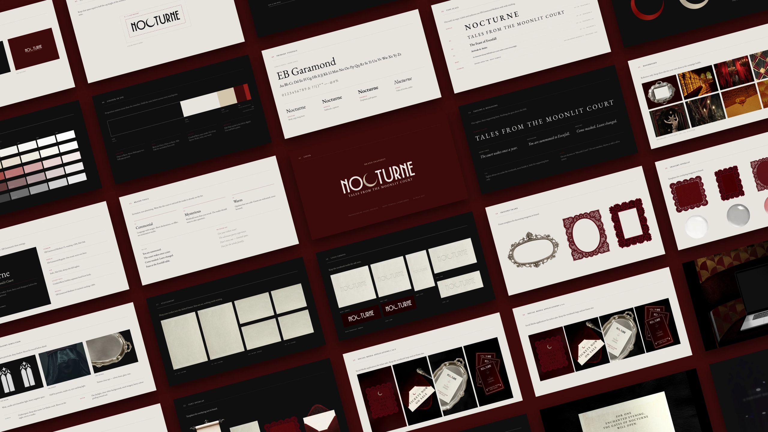
The guideline itself runs to twenty-odd spreads: wordmark construction and clear space, the colour system, the EB Garamond scale, brand voice, imagery direction, stationery, and the social templates the feed is built from.
The silver tray became a recurring device. It shows up in the ad set and again on the website, which is how a motif earns its place: it has to survive more than one use.
The website
The site had to do the selling, so it was built dark. Onyx ground almost the whole way down, with the wordmark over slow footage of the court, and the two things a first-time visitor needs sitting immediately underneath: the date and the venue.
Underneath the hero the page does something we do not often get to do, which is change material. Sections drop onto aged paper panels, so scrolling feels like turning pages in something rather than moving down a page. The ornate silver frames come back as containers: a mirror frame around imagery, a serving tray holding the venue, date and parking details as three cards laid on the metal.
The Vision section is the one that carries the positioning, and it is deliberately the quietest part of the site. Long measure, generous leading, a single candelabra sitting in the dark next to it. Nothing moves. After a hero that does move, the stillness is the point.
The three chapters of the night each get their own card in the accent red, in running order, so the structure of the evening is legible in about ten seconds. Each is introduced by an object rather than a photo of a party: Starlit Square gets a crystal ball, because we still had no photography to work with and inventing a world is more honest than faking a crowd.
Ticketing hands off to Eventbrite, which is the right call for a first edition. The job of the site is to make you want to go. The job of Eventbrite is to take the money.
The launch film
Last piece. We produced a brand film for the launch, and it is the closest thing the campaign has to footage of the event. It is not documentation, because there is nothing yet to document. It is the world the brand is promising, built.
What we would take to the next one
The accent theme system is the piece worth stealing. Any brand that runs on a cycle, an annual event, a seasonal drop, a touring show, has the same problem: it needs to feel new each time and identical every time. Splitting the palette into a locked core and one swappable accent solves it in a single line of a guideline, and it costs nothing to set up while you are already drawing the brand.
The other lesson is about what to do when there is nothing to photograph. The instinct is to fake it, source stock of a crowd at some other party and hope. We went the other way and made the brand the subject: the invitation on the tray, the crescent, the candelabra, the crystal ball. It is more honest, and it ages better, because next year when there is real photography the brand does not have to unlearn a look built out of somebody else's event.
Nocturne opens its doors on 24 July 2027. Tickets are on sale now at nocturneball.com.
Frequently asked questions
- Who is Nocturne and who runs it?
- Nocturne is a fantasy ball created by Event Society, held at Dust Temple in Currumbin on the Gold Coast. The first edition runs on Saturday 24 July 2027. Lucky Boy Agency created the brand, the guideline, the launch film, the launch ad set and the website.
- What was included in the branding work?
- Brand strategy and direction, three exploratory design routes, a custom-drawn wordmark and crescent brand mark, a full colour and typography system, a brand guideline document, an invitation suite, a launch ad set, a launch brand film and the website.
- Why did the brand need more than one colour palette?
- Nocturne is a recurring event with a different theme each edition. The guideline locks a core palette of Onyx, Bone and Pale Oak and allows a single accent theme to change between editions, at the same usage ratio. That lets each year feel new without a rebrand.
- How do you brand an event that has not happened yet?
- You make the brand itself the subject. With no photography of a previous edition, every persuasive element has to come from the design, so we built the imagery around brand objects: the invitation, the crescent, the silver tray, the candelabra. It is more honest than sourcing stock of somebody else’s event, and it means the look does not have to be unlearned once real photography exists.
- How long does a project like this take?
- Branding and a website together typically run over a couple of months, and Nocturne launched roughly twelve months out from the event date so the brand had time to build an audience. If you want a scope and a timeline for your own project, get in touch.
The case study
See the full Nocturne case study
Branding, guideline, launch film and website for Event Society.